AandIS
AandIS
AandIS
AandIS
AandIS
AandIS
.png)
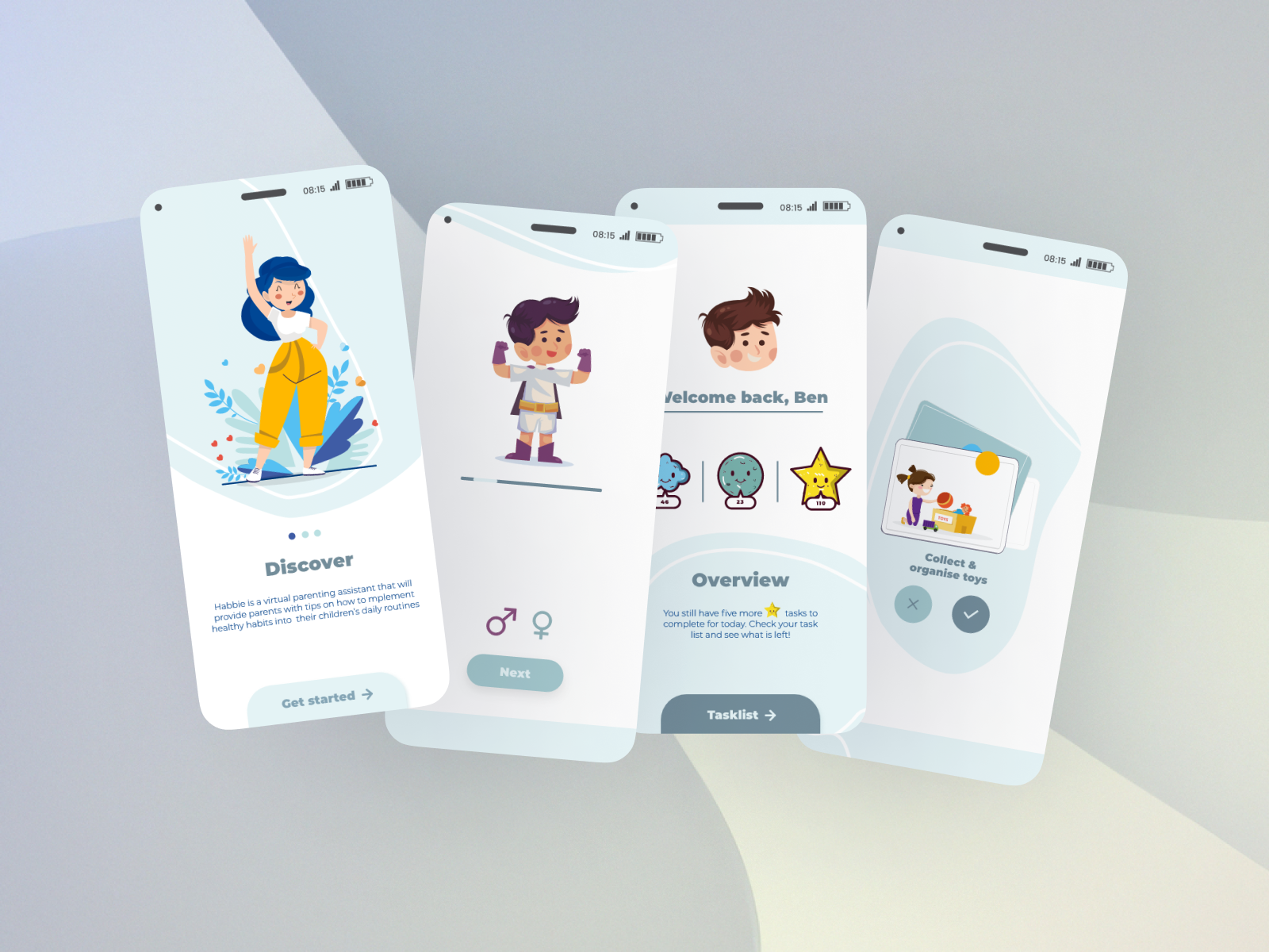
/PROJECT OVERVIEW/
The design challenge for this project was to shape a user experience, fostering lasting connections with both existing and newly onboarded clients, ultimately boosting user retention. AandIS, a small organisation that specializes in engancing businesses through efficient data utilization and internal intelligence analysis, approached my for a complete website redesign.
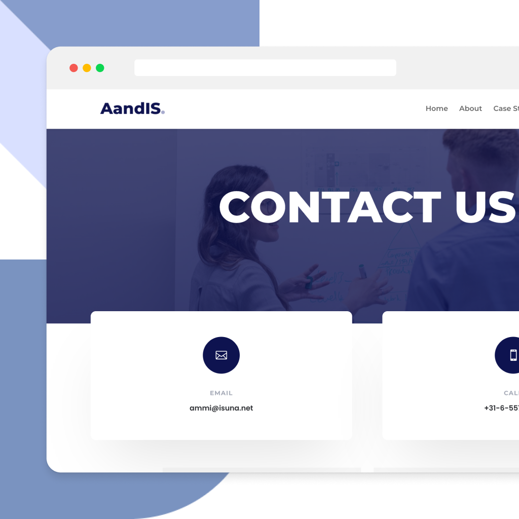
The initial state of their one-page website was not functional and short in critical areas, lacking structured information architecture, a clear visual hierarchy, and consistent application of UI patterns. The absence of these key components not only hindered effective navigation but also contributed to an overall deficiency in user engagement and retention on the site.
/Style tile/
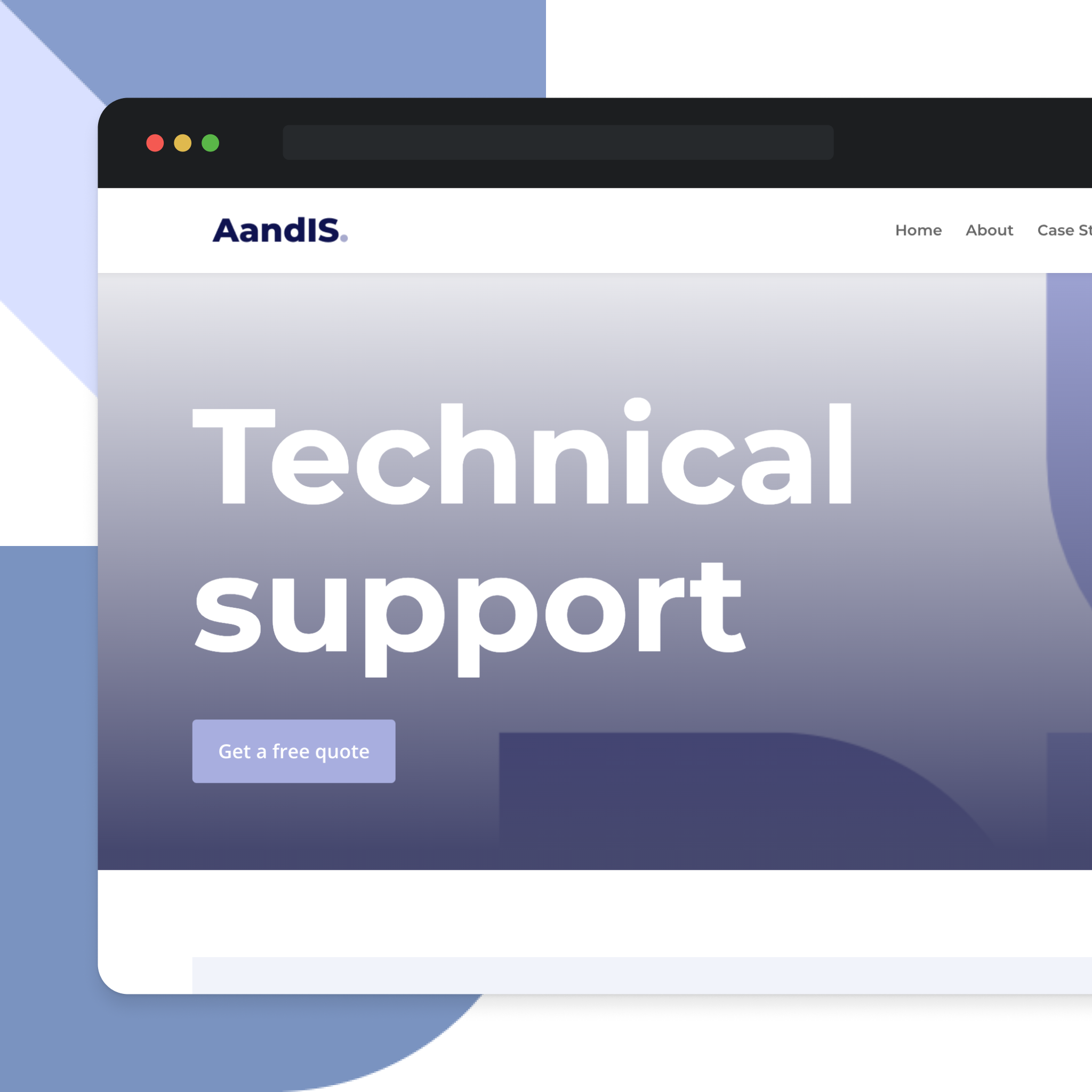
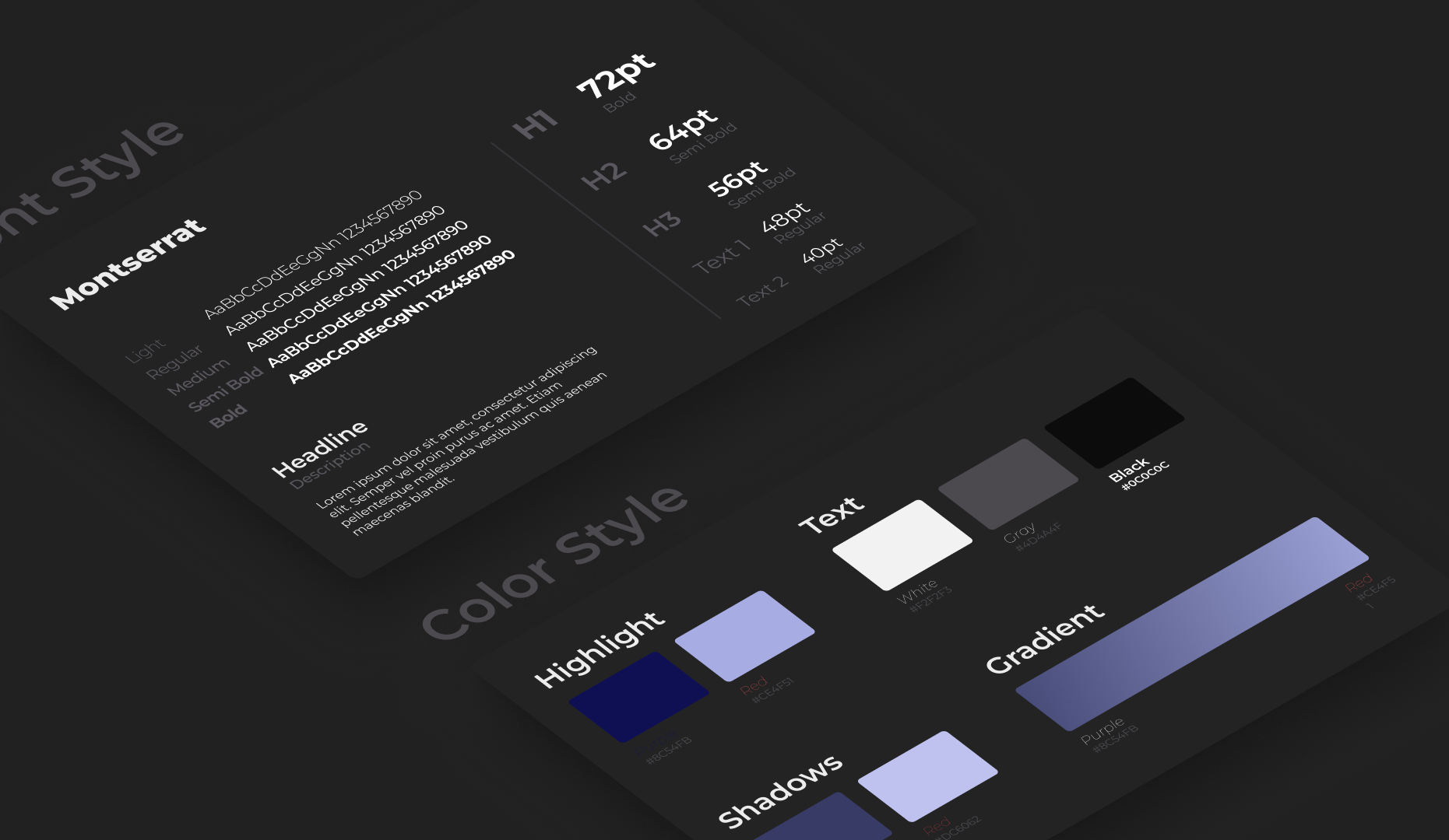
Style tiles are created in the first stages of a design project, providing a quick and efficient way to explore various design directions. After completing the research and idiation phase, I moved to the redesign with creating a style tile for AandIS website. This visual guide focused on essential design elements like colors, fonts and font weights.
The purpose of the style tile was to provide a preview of these key aspects without creatinga complete design. Essentially, the style tile acted as a map for the project's appearance, ensuring consistency and cohesive look. In essence, using a style tile streamlined communication, sped up decision-making, and set the tone for the subsequent design phases.
/Solution/
To successfully redesign AandIS website, an expert review was conducted, utilizing Nielsen's heuristics along with a comprehensive competitor analysis. The analysis resulted in clearly defined areas for improvement and specified requirements for the redesign.
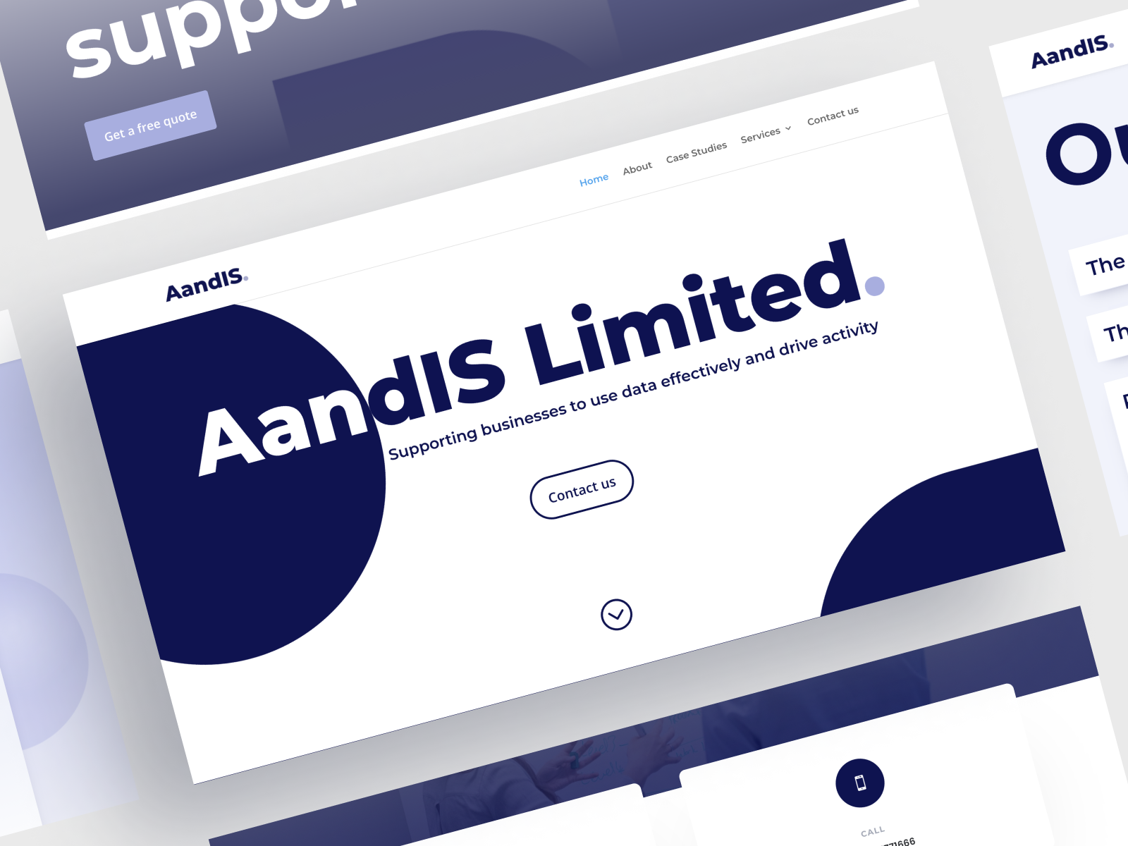
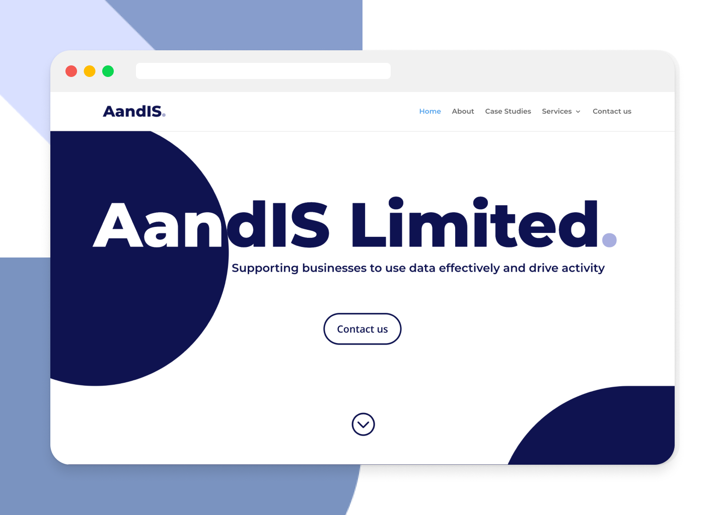
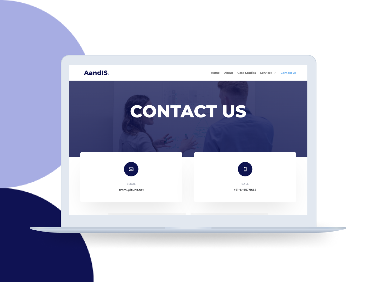
The newly designed site has an improved navigation with clearly defined pages, enhanced usability by making use of clear & easy to understand language and a clear system feedback. The brand identity was taken into consideration & the website is fully responsive on all devices.
For this project, I also worked on improving the brand identity. I managed to redesign and introduce a new logo, change the brand typography and color scheme.
/Solution/
To successfully redesign AandIS website, an expert review was conducted, utilizing Nielsen's heuristics along with a comprehensive competitor analysis. The analysis resulted in clearly defined areas for improvement and specified requirements for the redesign.
The newly designed site has an improved navigation with clearly defined pages, enhanced usability by making use of clear & easy to understand language and a clear system feedback. The brand identity was taken into consideration & the website is fully responsive on all devices.
For this project, I also worked on improving the brand identity. I managed to redesign and introduce a new logo, change the brand typography and color scheme.

/design challenge/
The design challenge for this project was to shape a user experience, fostering lasting connections with both existing and newly onboarded clients, ultimately boosting user retention. AandIS, a small organisation that specializes in engancing businesses through efficient data utilization and internal intelligence analysis, approached my for a complete website redesign.
The initial state of their one-page website was not functional and short in critical areas, lacking structured information architecture, a clear visual hierarchy, and consistent application of UI patterns. The absence of these key components not only hindered effective navigation but also contributed to an overall deficiency in user engagement and retention on the site.
/solution/
To successfully redesign AandIS website, an expert review was conducted, utilizing Nielsen's heuristics along with a comprehensive competitor analysis. The analysis resulted in clearly defined areas for improvement and specified requirements for the redesign.
The newly designed site has an improved navigation with clearly defined pages, enhanced usability by making use of clear & easy to understand language and a clear system feedback. The brand identity was taken into consideration & the website is fully responsive on all devices.
For this project, I also worked on improving the brand identity. I managed to redesign and introduce a new logo, change the brand typography and color scheme.
/process/
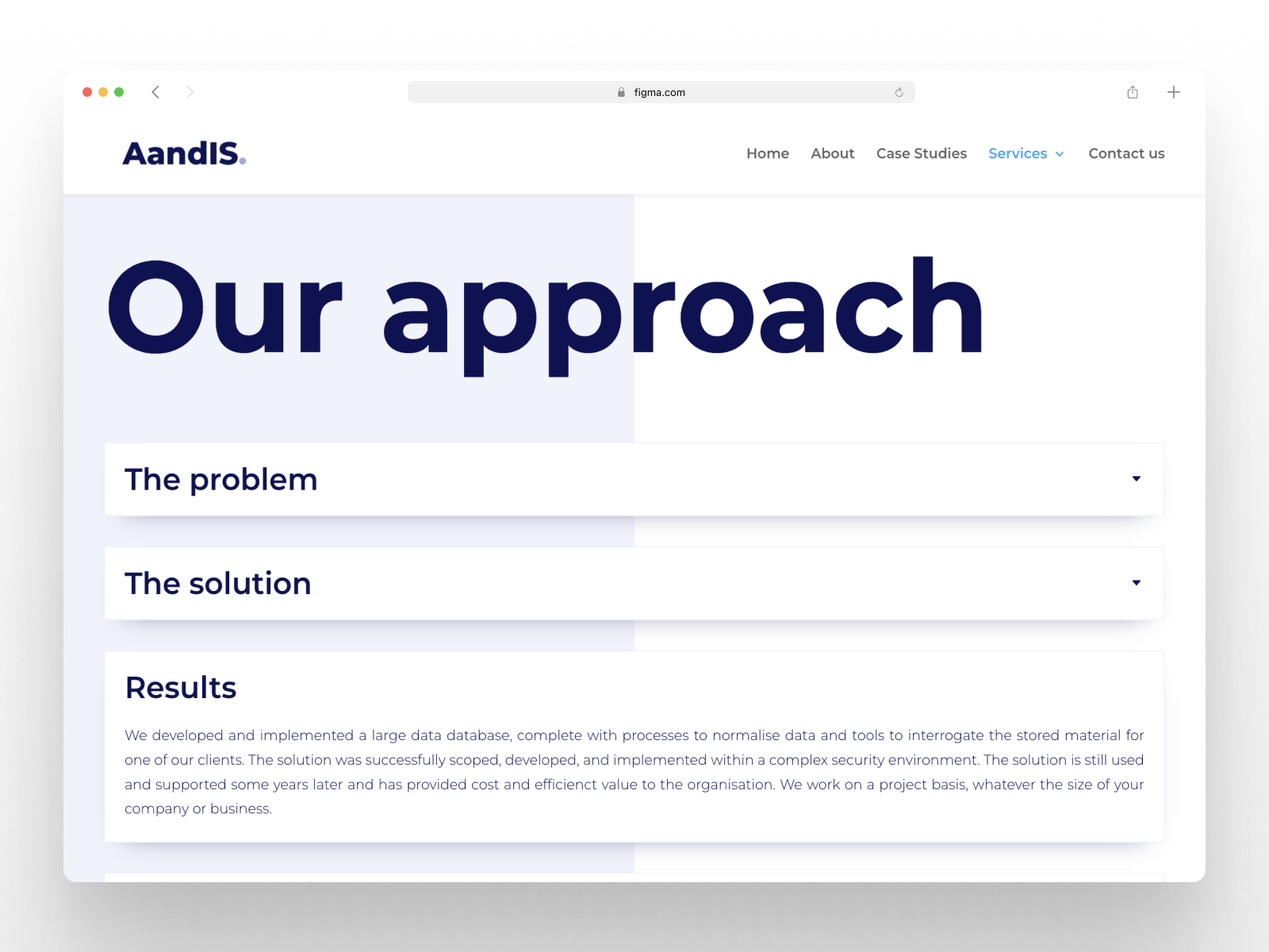
My focus on simplifying navigation has made the user journey more intuitive, facilitating improved content discovery. The modern design not only aligns with AandIS's brand identity but also presents a visually appealing and cohesive image. Addressing slow loading times, I optimized images and implemented performance-enhancing plugins, ensuring a faster and more responsive site.
AandIS now boasts a responsive design that delivers a seamless experience across all devices, with touch-friendly elements enhancing mobile usability. I also integrated analytics tools to provide valuable insights into user behavior, empowering AandIS to make informed, data-driven decisions.
Throughout the redesign process, I actively sought and incorporated user & stakeholder feedback, resulting in a website that not only meets but exceeds AandIS's expectations. This case study underscores the successful transformation of AandIS's digital presence, showcasing the tangible benefits of the WordPress redesign across various key performance indicators.
/personas &
user stories/
Style tiles are created in the first stages of a design project, providing a quick and efficient way to explore various design directions. After completing the research and idiation phase, I moved to the redesign with creating a style tile for AandIS website. This visual guide focused on essential design elements like colors, fonts and font weights.
The purpose of the style tile was to provide a preview of these key aspects without creatinga complete design. Essentially, the style tile acted as a map for the project's appearance, ensuring consistency and cohesive look. In essence, using a style tile streamlined communication, sped up decision-making, and set the tone for the subsequent design phases.
/ideation/
/wireframes/
/prototype/
/user testing/
/Design challenge/
The design challenge for this project was to shape a user experience, fostering lasting connections with both existing and newly onboarded clients, ultimately boosting user retention. AandIS, a small organisation that specializes in engancing businesses through efficient data utilization and internal intelligence analysis, approached my for a complete website redesign.
The initial state of their one-page website was not functional and short in critical areas, lacking structured information architecture, a clear visual hierarchy, and consistent application of UI patterns. The absence of these key components not only hindered effective navigation but also contributed to an overall deficiency in user engagement and retention on the site.
/solution/
To successfully redesign AandIS website, an expert review was conducted, utilizing Nielsen's heuristics along with a comprehensive competitor analysis. The analysis resulted in clearly defined areas for improvement and specified requirements for the redesign.
The newly designed site has an improved navigation with clearly defined pages, enhanced usability by making use of clear & easy to understand language and a clear system feedback. The brand identity was taken into consideration & the website is fully responsive on all devices.
For this project, I also worked on improving the brand identity. I managed to redesign and introduce a new logo, change the brand typography and color scheme.
/process/
My focus on simplifying navigation has made the user journey more intuitive, facilitating improved content discovery. The modern design not only aligns with AandIS's brand identity but also presents a visually appealing and cohesive image. Addressing slow loading times, I optimized images and implemented performance-enhancing plugins, ensuring a faster and more responsive site.
AandIS now boasts a responsive design that delivers a seamless experience across all devices, with touch-friendly elements enhancing mobile usability. I also integrated analytics tools to provide valuable insights into user behavior, empowering AandIS to make informed, data-driven decisions.
Throughout the redesign process, I actively sought and incorporated user & stakeholder feedback, resulting in a website that not only meets but exceeds AandIS's expectations. This case study underscores the successful transformation of AandIS's digital presence, showcasing the tangible benefits of the WordPress redesign across various key performance indicators.
/ideation & early testing/
Style tiles are created in the first stages of a design project, providing a quick and efficient way to explore various design directions. After completing the research and idiation phase, I moved to the redesign with creating a style tile for AandIS website. This visual guide focused on essential design elements like colors, fonts and font weights.
The purpose of the style tile was to provide a preview of these key aspects without creatinga complete design. Essentially, the style tile acted as a map for the project's appearance, ensuring consistency and cohesive look. In essence, using a style tile streamlined communication, sped up decision-making, and set the tone for the subsequent design phases.
/wireframing/
/prototype/
/overview/
The design challenge for this project was to shape a user experience, fostering lasting connections with both existing and newly onboarded clients, ultimately boosting user retention. AandIS, a small organisation that specializes in engancing businesses through efficient data utilization and internal intelligence analysis, approached my for a complete website redesign.
The initial state of their one-page website was not functional and short in critical areas, lacking structured information architecture, a clear visual hierarchy, and consistent application of UI patterns. The absence of these key components not only hindered effective navigation but also contributed to an overall deficiency in user engagement and retention on the site.
/design challenge/
To successfully redesign AandIS website, an expert review was conducted, utilizing Nielsen's heuristics along with a comprehensive competitor analysis. The analysis resulted in clearly defined areas for improvement and specified requirements for the redesign.
The newly designed site has an improved navigation with clearly defined pages, enhanced usability by making use of clear & easy to understand language and a clear system feedback. The brand identity was taken into consideration & the website is fully responsive on all devices.
For this project, I also worked on improving the brand identity. I managed to redesign and introduce a new logo, change the brand typography and color scheme.
.png)